Duda Tip: Custom Button - Icon Hover Animation

Have you enjoyed the last two Duda tips but want a more subtle yet creative hover animation to use on your custom button? If so, you are at the right place. In this Duda tip, we will go through the steps of changing the hover action we had in our first Custom Button Duda Tip to one that is a subtle animation for our third and final way of creating a custom button. Follow along with the instructions below to implement this Duda tip on your site or check out this video to watch each step in real time.
If you already have your custom button our Duda tip: Adding your Own Icon, you can skip to Step 3. If not, feel free to start with Step 1.
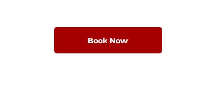
Step 1. Add a Button Widget.
Add a button by dragging a button widget to your row.
Step 2. Add the classes to your button
Right-click the button and edit HTML/CSS.
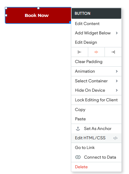
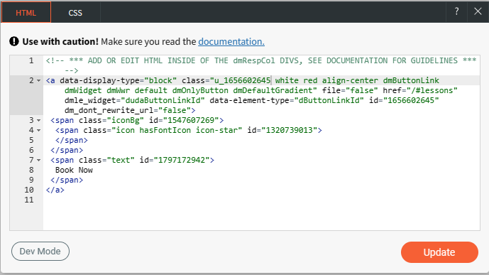
Add the classes "white" and "red"
In this example, we've used 2 classes:
- White: This class will be the content placeholder for the default icon.
- Red: This class will be the icon once the button is hovered.
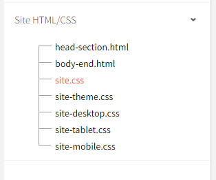
Step 3. Add the classes to the site's CSS.
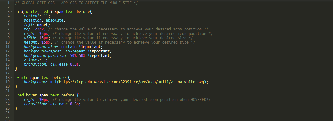
Go to dev mode, and under site.css, paste the code snippet below. (shortcut: CTRL + ALT + C)
Then navigate to site.css and paste the code below. If you are working with the button from the beginning of the series, simply add the transition below and replace the code under the red class.
We have highlighted the difference in the code by making the font blue.
:is(.white,.red ) span.text:before{
content: '';
position: absolute;
left: unset;
top: 22px; /* change the value if necessary to achieve your desired icon position */
right: 35px; /* change the value if necessary to achieve your desired icon position */
width: 15px; /* change the value if necessary to achieve your desired size */
height: 15px; /* change the value if necessary to achieve your desired size */
background-size: contain !important;
background-repeat: no-repeat !important;
background-position: 50% 50% !important;
z-index: 1;
transition: all ease 0.3s;
}
.white span.text:before {
background: url(https://irp.cdn-website.com/3239fcce/dms3rep/multi/arrow-white.svg);
}
.red:hover span.text:before {
right: 30px; /* change the value to achieve your desired icon position when Hovered*/
transition: all ease 0.3s;
}
Why those CSS changes? Instead of adding a background URL under the "red" class, we added a right 30px value. This simply means we are moving the arrow 30px from the right. We also added a transition to smoothen the animation effect. If you are wondering how to change the arrows to a different icon, check out how in our first tip of this series.
Step 4. Save and close.
Congratulations! You have reached the end of our custom button series. You can now take advantage of the three unique custom buttons that you have learned to create with this series. These buttons can be utilized on all of your websites, providing consistent and personalized experiences for your audience. Try them all and show us what you create!


