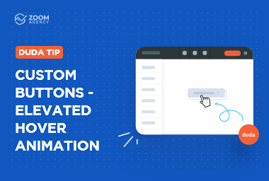
Duda Tip: Custom Buttons - Adding Your Own Icon

Need your website to stand out with subtle custom touches? Custom buttons might be the answer! In this step-by-step tutorial, we will take you through the process of adding a custom icon to your buttons which is the beginning of your very own custom buttons. Learn how with the easy steps below, or check out this video to watch each step in real time. Let's get started!
Pre-requisite
We recommend you have an icon SVG ready to go in the two colors you want to use. You can download free icons at https://www.flaticon.com/. Since these icons are images, the icon's colors are fixed. You'll need to change the color first on an image editing software like Photoshop/Illustrator or a free site like https://boxy-svg.com/ before uploading them to the media manager. Once you have them, upload them to the media manager. We will use them later in the tutorial.
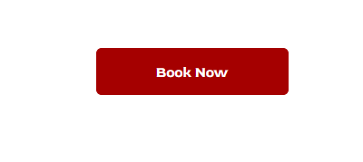
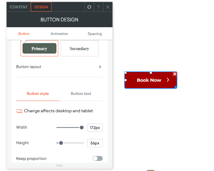
Step 1. Add a Button Widget.
Add a button by dragging a button widget to your row.
Step 2. Add the classes to your button
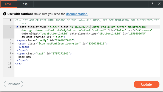
Right-click the button and edit HTML/CSS.
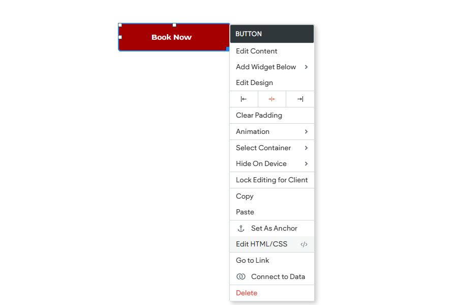
Add the classes "white" and "red"
In this example, we've used 2 classes:
- white: This class will be the content placeholder for the default icon.
- red: This class will be the icon once the button is hovered.
Step 3. Add the classes to the site's CSS.
Go to dev mode, and under site.css, paste the code snippet below.
:is(.white,.red ) span.text:before{
content: '';
position: absolute;
left: unset;
top: 15px; /* change the value if necessary to achieve your desired icon position */
right: 25px; /* change the value if necessary to achieve your desired icon position */
width: 25px; /* change the value if necessary to achieve your desired size */
height: 25px; /* change the value if necessary to achieve your desired size */
background-size: contain !important;
background-repeat: no-repeat !important;
background-position: 50% 50% !important;
z-index: 1;
}
.white span.text:before {
background: url(https://irp.cdn-website.com/3239fcce/dms3rep/multi/arrow-white.svg);
}
.red:hover span.text:before {
background:url(https://irp.cdn-website.com/3239fcce/dms3rep/multi/arrow-red.svg);
}
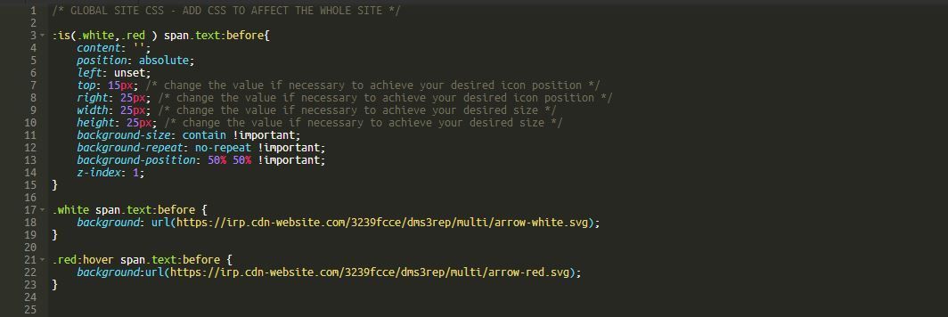
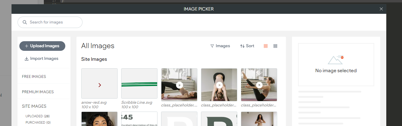
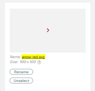
NOTE: You will need to replace the URLs under white and red by getting the links of the icons you want to use. You can get the links by clicking "Get Image URL" on the top left and clicking the name of each selected icon you want to use. You can also change the values here to change the icon's size and positioning.
Step 4. Save and close.
Style as you wish! And there you have it, the beginning of your custom buttons. Don't miss our next Duda tip where we will take you through the process of adding an offset custom hover animation if you'd like to try a different hover animation!


